Are you mobile friendly?
Way back in the early days of the internet, pretty much all websites were either hard-coded with standard Html or with a scripting language like Perl or PHP. Or a combination of them all. There weren’t convenient and easy to use tools like WordPress and Joomla to make our blogging jobs a bit easier.
But on the other hand, we didn’t worry about screen sizes – even though eventually a lot of people were getting larger monitors, pretty much everything was coded for standard 640 * 480 screens since that was the smallest standard size. That made life pretty easy. And there were loads of good html editors that made the job of creating pages fairly easy. Life was easy.
Then Steve Jobs came along and decided to mess with our lives by creating the iPhone and the iPad. This started the phenomena we now see where we have to contend with screens anywhere from the size of a flip phone right up to 70 inch smart tvs.
According to Comscore, mobile internet usage outstripped traditional desktops in 2014. And according to Google, internet searches on mobile devices overtook desktop computers in 2015. The trend is clearly not ever going to shift back. Mobile use on the internet is here to stay. Get used to it or get left behind.
Below is a screenshot from Google Analytics for one of our niche sites for device usage for 2015.
And here is a screenshot for the same site for the last 30 days (as of January 13, 2016)
Less than 20% of this site’s traffic comes from desktop computers now. Not all sites and all niches will have similar numbers but the trend is clearly in favor of mobile devices.
How do I know if my site is mobile friendly?
Browse your site on your smartphone. If the site isn’t legible, if you have to scroll from side to side and if you don’t have a mobile friendly menu, then your site isn’t mobile friendly.
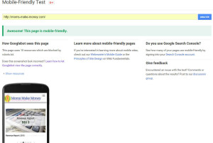
You can also check out Google’s Mobile Friendly Test which will give you good guidance on what you need to do. This tool is invaluable because it not only shows you what is wrong with your site for mobile viewers, it shows you how Google ‘sees’ your site. Which is important since that is a key indicator of how you will perform in Google’s mobile searches. If your site sucks on mobile and only works well on desktops, Google will lower your mobile search rankings.
Here is a screen shot of our site run through the mobile friendly test:
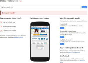
We are A-Ok here because we built the site on a responsive WordPress theme, knowing that a good chunk of our visitors would be using mobile devices. But let’s take a look at a site that doesn’t fare so well, our friends at Shareasale:
Ouch. While we love Shareasale as an affiliate network, I’m pretty sure their web design hasn’t changed since we were using them back in the early 2000’s. It’s not just Shareasale though, CJ and even Amazon’s affiliate pages are not mobile friendly. We, as bloggers, don’t have the freedom to cater to only desktop computers anymore.
How do I make my site mobile friendly?
Luckily, it’s not all that hard anymore. If you are using WordPress, you can choose from thousands of responsive themes. A responsive theme means that it is coded to judge the users’ screen size and adjust the website accordingly so that no matter the size of the screen, the website will be displayed properly.
We have two top choices for WordPress themes.
 |
StudiopressBuilt on the Genesis framework, Studiopress has a huge list of really beautiful WordPress themes available. With a little bit of knowledge, all these themes can be altered to fit exactly to your needs. |
 |
Themify.meBuilt on their own robust framework, Themify.me is a great value. You can get access to all their themes for as little as $79. Moms-make-money is built on a Themify.me theme. |
There are also lots of free responsive themes available, though they won’t be near as polished or user-friendly. The easiest way I know to search for these (other than Google) is in your WordPress admin page: Appearance -> Themes and then choosing ‘add new’ at the top. Then click on ‘feature filter’ and choose ‘responsive layout’ from the second column. Click ‘apply filters’ and you’ll then get a list of all responsive themes that are available on WordPress for free.
Test, Test, Test
Once you think you have your site looking good, try to test it on all major devices. You can use a site like Viewlike.us to give a really good idea of how your site will look on a ton of different devices. But if you have the ability, test your site or have it tested by friends directly on the major mobile platforms – meaning Apple and Android and even Blackberry. We only have android phones and tablets and Windows desktops and laptops so when we create a new site or modify an existing one, I ask friends that have iPhones, iPads and Macbooks to test on their machines and give us feedback. Chances are, if you use Studiopress or Themify.me you don’t have to worry very much about how things will look in different browsers.
So are you mobile friendly?
Hopefully your site is already mobile friendly and you’re getting the most out of the increasing mobile traffic you’re receiving. If not, don’t despair. It’s not that hard to update your site to be mobile friendly and doesn’t have to cost you much – or anything for that matter if you choose. If you have any other questions feel free to contact us either below in the comments section or on our contact us page.
photo credit: Japanexperterna


January 22, 2016 @ 12:05 pm
Great advice for people starting out (like me!) I just started my blog yesterday and i am going to do this test like you suggest thank you!!!!!