Do you know what your visitors want to see?

Just last week we had one of our niche sites out of the blue get a huge jump in Google traffic. I’ll probably write about that later, but for this article it’s enough to know that our fairly average daily pageviews went from about 1,700 on Jan 5, 2016 to 2,600 on Jan. 6. A roughly 50% increase in traffic overnight.
The site had been ramping up in traffic consistently over the past year as we slowly added more and more content but this jump was pretty cool. It was exciting but also turned out to be a bit of a learning experience.
This niche site, like most of our others is an affiliate site. We had known for quite a while that the site wasn’t converting the way we’d like. Part of the reason for this is that some of the keywords that drive traffic to the site tend to drive ‘tirekickers’ and we also get over 45% of our traffic from outside the US and Canada, who are much more unlikely to purchase the products. Still, we know there is room for improvement. Always is.
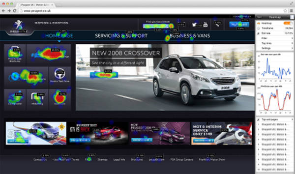
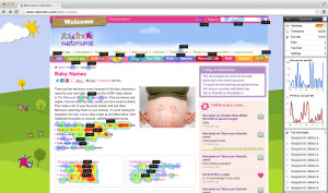
So when the jump in traffic came, I figured it was time to see if there was some way to better cash in on this unexpected boost. I remembered I had installed this heatmap app quite a while ago but honestly had had a hard time getting it to run and had forgotten about it. I guess whatever problems I had running it were resolved by this time as when I opened it, it ran perfectly and gave me a heatmap for the site similar to the one below (no, this isn’t our site)

What the heatmap shows is where your visitors are clicking, right down to the general area. For instance, we have a banner in the side bar advertising one of the products we promote on the site. The banner has an ‘order now’ icon in it, though it is part of main image itself. Amazingly, almost all people that clicked on that banner according to the heatmap stats clicked on this button that doesn’t really exist. Surprised the heck out of me.
How it Works
I’m not an expert on this plugin by any means but as far as I can tell, this is how it works. On the free version – which we used, it allows you to choose up to five pages to record. Then you give it some time to record clicks on the site and it builds up a heatmap. When you are on your site and logged into the admin panel in WordPress, go to your home page (or whatever pages you have set to record) and it will show you a heatmap like you see above. If you don’t see it, click on the heatmap link on the top control bar and it will ask you to login and then show you the heatmap. As near as I can tell, if you have a low traffic site it will take longer to build up the map. Maybe that’s why it didn’t work for me when I first installed it – I didn’t give it time.
Let’s get to the point
What I saw when looking at the heatmap for this site is that we had a large box advertising another page from the site on the home page which was taking up a big chunk of real estate above the fold and was getting very little traffic to it. It was pretty easy to realize at that point that the box had to go. Space above the fold is precious and valuable and it was pretty easy to see that this was a waste of space. I rejigged the home page a bit, removed the box in question and added links to the articles I knew people were looking at the most. So far, I have only modified the home page which actually only accounts for 25% of entries to the site. While the results weren’t jaw dropping, they were noticeable. And the changes took me all of 20 minutes – less time than to write this article.
Results
It’s been less than a week at this point, but by making these changes I was able to:
- Increase pageviews by 0.2 per session. It seems like a small increase, but at 30,000 sessions / month an extra 0.2 pageviews per session equals another 6,000 pageviews.
- Increase session duration by 8 – 12 seconds. Again, doesn’t seem like much but when our average duration was at 1:04 that is a good percentage.
- Decrease bounce rate by almost 4%. Not huge, but all things considered it’s a good start. The site’s bounce rate has been slowly creeping up from around 68% at the start of 2015 to 74% by the end of the year. This decrease gets us back just below 70% which like I said is a good start.
Summary
Did the changes we made increase our sales? That’s really hard to say but I think it helped a little. But the payoff is in the long run in my opinion. Google wants to see sites that retain user interest, that have lower bounce rates and higher session duration than their peers. In time, better metrics like these will show Google that you are the better choice to send traffic to and that in turn will increase your search engine rankings. Small improvements made over time and patience to see the outcome are the key.


January 17, 2016 @ 6:39 am
Great tip about the heatmap. I had a similar problem probably about a year back, couldn’t get it to work. We probably tried the same one. I’ve got this one loaded now that you recommended and will be patient to see what it shows. Great tips about how to use it to tweak the layout of your site for better results.
January 19, 2016 @ 4:06 pm
I installed heatmap on another one of our sites just after the article and soon remembered the problem. It makes you login with google or facebook which is fine but it keeps logging me out. Seems like when it has run for a while and there is more info it has recorded this problem seems to go away. At least that’s how it seems to me.
January 17, 2016 @ 2:46 pm
I’ve never heard of the heat map. Looks to be a great tool! Thanks for sharing. 🙂
November 8, 2016 @ 12:58 am
The heat map is a great tool. Thanks!