
What do you think of the new adverts ?
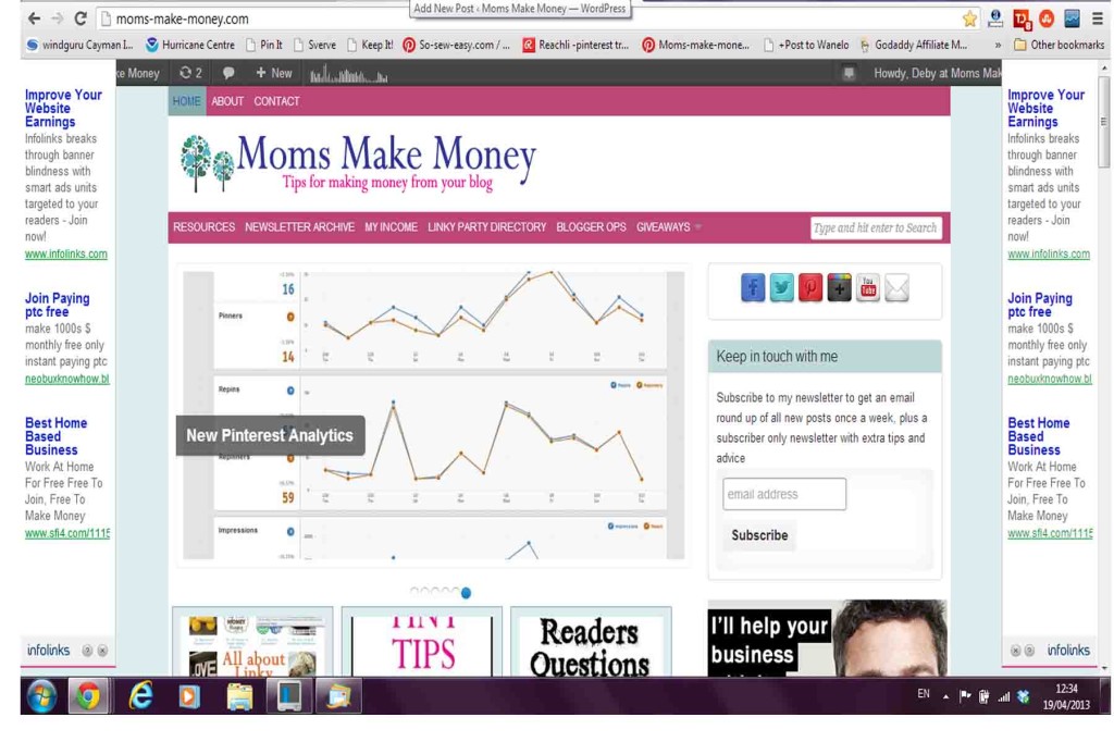
If you are using a widescreen monitor you might now be seeing some new advertising on the site. My site is optimised to show on all screen sizes and so when you view with a widescreen monitor there are blank spaces down the side left and right. I’m experimenting with some new advertising that automatically fills those spaces if they are blank.
You might be able to see the new adverts left and right. Or you might not.
Here is a screen view of what they look like.
Each one comes with a X which you can use to close them if you want, or if you don’t find them distracting you can leave them, and if you find them interesting you can click them – although I don’t earn any extra money if you do.
I want to be able to advise my readers on all forms of advertising and the options and payouts involved so I’ll be trialing this new advert format for a while to see what readers think and see how much income it brings. This is quite a lot more in your face than the usual display adverts so I’ll be very interested to read your comments below.
Authored by: Deby at Moms Make Money


April 19, 2013 @ 1:05 pm
I think they aren’t annoying at all. If some one doesn’t want to look they can concentrate on the middle of the screen.
April 21, 2013 @ 9:48 pm
I think it’s busy…my eye flips around. I wonder if they were photo/color ads if it would matter. It just might be too much white without anything strong to rest the eye.
Thanks for all you’re doing. 🙂
April 21, 2013 @ 10:12 pm
I like how they slowly slide in from the sides so you can’t miss them, but they’re perfectly balanced and unobtrusive so it’s up to you if you want to look at them right away or save them for later when you’ve finished reading the post!
April 21, 2013 @ 10:51 pm
I gotta be honest and say that they detract from the look of your site, and make everything look cheap, IMHO. But that being said, I like that you are trying new things out to see what works and what doesn’t. I look forward to hearing what you find out!
April 22, 2013 @ 6:57 am
Yeah me too! The previews show them as a very nice set of matching graphics that actually look pretty stylish, but I am only seeing these rows of text links on a white background, and I completely agree – I think they look cheap. I don’t think I’ll be trailing this for very much longer!